Monthly Archives: October 2012

Magic Mike (2012)

Mike is a 30 year old male stripper that takes a broke 19 year old kid into the dance club business.

The only thing that makes this movie worth watching is that there is a lot of man candy to watch. Other than that, there is nothing to brag about. Weak storey, poor acting, horrible direction, and the cinematography is the worst part. Camera work and editing is sad and amateurish. Bad camera angles, few close-ups, over use of wide angle lens, and bad lighting. Editing does not have the expected and required cut-aways to close-ups. It made me wonder if they hired someone’s cousin that happened to get a new video camera for their birthday to shoot this thing.

I had no idea there were several other well known celebrities were in this flick, all of which were used as extras in the entire shoot. And all of which are strong actors, and in my opinion better than the focused stars. It made me wonder if it was due to scene stealing jealousy, as having them a little more in front and being an actual part of the storey would have made this thing a far far better film. Even just a few close-ups and a few lines each would have made it more worthy. The actors I’m referring to are Matt Bomer from White Collar, Adam Rodriguez from CSI Miami, and Joe Manganiello from True Blood. It was obvious and felt odd to have these guys so deliberately in the background. Even a weekly TV show would have made better use of background actors.

If seeing mostly naked hot men dance is enough to watch a movie, this is a decent pick. These guys are incredibly hot. But even that could have been made more enjoyable with better camera work. And the oddest thing is Channing Tatum has appeared in dance movies where they had better cinematography, so why is it so drastically different in this one? Very disappointing. Channing is obviously on a roll, I hope he starts to make better movies in the future if he plans to continue producing.

4/10

Image

TomTom Android App Review

TomTom recently released a GPS navigation map app for the Android platform. It’s about time. I had a TomTom GPS app and blue tooth receiver on my Palm Treo years ago. Long before anyone dreamed up Android, yet they have dragged their feet on releasing an app for a phone since (as far as I know.) I can only presume it was to protect their dedicated device market. I can’t see the GPS stand-alone devices having anywhere near the market share they once did with the free phone turn-by-turn alternatives available from Google, Apple, Nokia and others.

I purchased the $60 TomTom map app for the North America region only cause I wanted a data free way of having turn-by-turn navigation while travelling outside of Canada, or when I have no cell coverage in Canada. My cell carrier is Fido (Rogers) so I have no roaming fees inside Canada, so using Google maps here shouldn’t be an issue except when outside of cell tower coverage, which can easily happen in outlying areas of Canada, even at the lake.

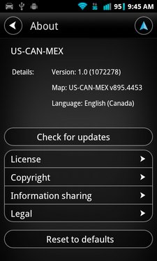
The download of the app is several meg. Then downloading the North America map was 20some megs and took some time even on WiFi. So leave your phone motionless while downloading, as an interruption will mean starting over, as it does not use any smart download system that can continue if disconnected. Yes, this did happen to me walking around my house and the phone changing routers upstairs to downstairs.

Starting TomTom on Android requires some patience, as it takes a good half minute to start the app and load the map, this is on a Dual-core 1 GHz phone. This slow start was an issue back on my Palm Treo and is also the case on starting a dedicated TomTom device. No instant on for TomTom on any device I’ve used.

Features and usage are similar to the stand-a-lone TomTom’s, accept for some noticeable bugs and short comings I realized early on. Most TomTom devices have the ability to alert you when you exceed the speed limit, as does this app. It does not work for me on my device, assuming it works at all in the app. I contacted TomTom tech support and they replied with the usual call centre nonsense of uninstalling and reinstalling, or doing a factory reset of the phone. Both are incredibly ridiculous solutions for a working app. But this is the only feature that isn’t working so far, and audio like voice does work, so neither solution is what I consider intelligent. I’d like to know if this feature works for anyone else.

The other shortcoming is the lack of audio alerts when you are close to a Point of Interest (POI.) This feature is standard on all TomTom devices I’ve used and owned. I contacted TomTom tech support and the feature doesn’t exist, which is why I couldn’t find it, and their reply was that it “may” be implemented some day. Another typical call centre non-committal response.

Both tech support email complaints took several days to get answered, and both were escalated to a “supervisor”, and that’s the replies I received after escalating. My experience with TomTom tech support over the years has been similar, several days at least for a response, then some generic non-helpful (though polite) reply.

As for the general use of turn-by-turn navigation, it works as expected, and no better or worse than a regular TomTom device, short of the very disappointing lack of audio alerts for driving speed and POI’s. So far the Android app on my phone has found enough satellites to work fairly quickly, something that has always been an issue on all stand-a-lone TomTom devices I’ve used. But that will be due to the hardware being used, and not the software being better on Android than their own devices.

I’m glad I have a cellular data free means of navigation now, however I was very much looking forward to the two features that are lacking, that would have helped with locating red light cameras and staying within the speed limits. So the bottom line is that TomTom on Android is a very basic turn-by-turn navigation map with few frills, in fact fewer frills than I got on a TomTom device I purchased about 10 years ago.

Rating: 7/10

screenshot-20121016-094856am Image

Source Code Pro Font

Adobe recently released an Open Source font they call Source Code Pro, and be downloaded here.

I’ve always used Courier New for my text editors (my fav being EditPad Pro) or source code editor (Delphi) but this “news” caused me to investigate this newly hyped font in the tech world, and see if it would be an improvement for me in these two areas.

My first reaction was the zero. I simply could not get past, and have always disliked zeros with a bulls-eye dot in the centre. It’s distracting to say the least.

Image

So the first thing I did was modify the font using Font Creator Program from High Logic. I simply erased the target dots in the zeros and replaced with a proper digital zero slash bar as you can see below. That improved things a lot for me.

The second thing that stood out was the spacing. Obviously to us coders and raw text editors, this is a mono-spaced font, but the font width is noticeably wider than many other mono-spaced fonts. And I also found this distracting. Again refer to the example below.

But this new editor and coding font interest I found myself in, caused me to consider some other fonts. And I discovered that a somewhat common and already existing font was available to me, and I found when I searched online that others were already using this as an alternative to Courier New. And that font is called Consolas, and was already installed for me with Windows 7.

Consolas has a very similar style to this new Source Code Pro font, or vice versa. It already has the correct and proper slash through the zero, is a more readable width, and has a more Courier style than some of the modernized exaggeration in Source Code Pro, like the letter “i” as you can see below.

Regardless of the big company hype and the source code name, I am finding Consolas type to be a nice alternative to Courier New, without the oddities that Adobe has placed in Source Code Pro. But thanks to the news report, I discovered Consolas.

Image

Asus Transformer Prime TF201 Updates to Jelly Bean 4.1

I read this week that some Android devices were getting the update to Android 4.1, also known as Jelly Bean to those numerically impaired people like Google engineers. Let’s refer to Google engineers as Jelly Beans, shall we?

Last night I did a manual update check in the Settings app on my Asus Transformer Prime. At first it said no update available, then changed to update available. I selected the update option, and it immediately started to download, and stalled out at 7%. And there it stayed for an extended period of time, so I left it overnight. And I completed the reboot and upgrade this morning.

The latest version is now 4.1.1. And my first reaction after using the tablet few a few minutes is…big deal! Sarcasm intended. Like most Android upgrades, it’s all media hype and little user experience improvement. Very small cosmetic changes, feels the same over all to this user, on this fast tablet.

The most noticeable change was the Asus Weather widget (powered by AccuWeather) stopped working. It’s a typical main widget on the home screen when you buy this Asus tablet. I went into the settings and it wouldn’t update, last update 2010. The device didn’t exist in 2010. So I switched from it guessing my location to me hard selecting the location, still no luck. I switched it back and forth a few times and refreshed the data a dozen times and it finally started working again…for the moment. Could be a glitch with AccuWeather with bad timing, but I’ll blame the Jelly Beans for now.

Another new feature in 4.1 is a new search app. It wanted to download and install right after the upgrade. I installed it like a good little sheep user and it immediately advertised some other Google app called Google Now at start up. And in portrait mode only. It would not switch to the standard tablet view we know as landscape. So after selecting “Next” several times and “Not right now” to this Now thing app I know nothing about (I thought I was installing Search) it finally would switch back to landscape mode. Obviously the Jelly Bean that created that feature advertisement only owns a phone he holds in portrait mode when testing. BTW the app is simply called Google once installed, not Search or Google Search, so I thought that is interesting. Propagating the company name as the verb we use for search, and not the English language. I somehow take offence to this, plus I had trouble finding it in the app list after installing, as I was looking for Search or Google Search as they called it before and during install. I find Google conically inconsistent.

Overall there is not a lot that is shockingly new. A decent incremental upgrade I’m sure, but that’s all it is. No massive or earth shaking changes to a tablet user that was using 4.0.x. I suppose once again my biggest complaint is all the hype that most media people that drank the coolaid have touted about Jelly Bean 4.1. If it was a silent update I may not have even noticed for a while till I finally saw Waldo in the background…I mean a small graphic change to the notification list.

I do want to see Android continually improve, what I don’t want to see is over-hyped reports of imagined improvements. Keep it real, put the cup down.

Image

Why I No Longer Watch Geek Beat TV

When I first started watching Geek Beat TV, back in the early stages of this online show, it was a diamond in the rough. Back then, it was hard to find a well put together tech show, about what’s new in tech and the tech world. I watched it daily and there was always something of interest to me, as they focused on what was new on tech hardware, tech news and they did interesting reviews.

Now I personally find very little of the original content style in this broadcast. They no longer seem to produce a daily tech news show in the same feed as I signed up for. Now they substitute random reviews from what I guess are affiliate contacts, and they like to show what they carry in their back packs, and their personal opinion on whatever interests them currently. Little of which I originally signed up for.

Let’s not leave out the unprofessional and annoying “bloopers” they add at the beginning of the show, the middle of the show and the end of the show. Most of which appear to me to be generated and completely fake bloopers, in my observation. And even if they are not, I can’t see why any mature person would care to watch these manufactured “bloopers”. It adds nothing to a show for those of us grown-ups that are looking for tech news.

I’ve watched the Geek Beat TV show grow from a struggling podcast that was made in their home, to downsizing their home to another location so they could focus on leaving their day jobs and working on creating a quality tech podcast, to changing distribution companies, and moving into a professional office space with more room, equipment and personnel. And in my own observation and opinion, the show climaxed in professionalism and quality somewhere in the middle between now and when they started this show under another name.

In general, I’ve seen many podcasts grow and get overwhelmed with their own success, heads swollen with self importance, and loose sight of the content and intent of the original show. I think the reason for this is often that these shows have no actual producers or production companies behind them, to keep them inline and focused. They do what they want based on their whims, and the celebrity of the person behind the mike. I’m not saying this is what happened to Geek Beat, but my observation is a common problem in podcasting in my own opinion.

Regardless, I have sadly deleted the Geek Beat TV feed from my DVR and I am replacing it with shows from CNet.

Image